

BRANDING | PRINT | UI DESIGN | WEBSITE DESIGN
2020
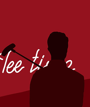
THE LITTLE HIDDEN BARS IN PERTH
Quirk. The guide out of sobriety
QUIRKY | MODERN | BOLD
Quirk is a publication developed and centred around being an informative guide for the targeted audience of tourists and locals, on the quirky themed bars and hidden entertainment places that are located in Perth’s City. It was created with the idea to strive for gathering up to date and helpful content on small hidden bars in Perth City, in order to make local's and tourist's nightlife adventures all the more easier and attainable.
This guidebook was designed with a look and feel that could be equally matched with the bold and themed bars that are featured in it. Creating a consistent yet powerful theme across the brand, we're able to elevate the overall experience of the clients and creating a higher return for the business' that are promoted through Quirk.

The concepts
The design sketches focused on the concept of partying. Depicting a few of the various types of alcoholic beverages that will be featured in the guidebook. Illustrations of dancing people and music symbols were also sketched to add a sense of fun to the main brand illustration.
After a thorough exploration of colours and layouts, the illustrations were merged into the shape of the first letter of the Quirk's name, linking it back to the brand. With a black and white theme for the elements to contrast against deep shades of red.
Variations of possible app icons were explored in order to choose the right icon for Quirk’s app. The Q was taken to represent the Quirk's name, with the initial layered waves of red and the idea of drops of liquid dripping from it. The liquid drops representing the alcoholic side of the quirky bars that this guide features. The icons were first designed in Adobe Illustrator before being coloured and shadowed in Adobe Photoshop.


QUIRK
The process
The process for this project involved stakeholder mapping, market research, development of personas, visual investigations, style guide development, prototyping & refinement of touchpoints to produce a fully refined brand identity and printing assets.
The brand’s guide was constructed to be utilized in both digital and non-digital mediums. From an app and website to clothing and stickers. Giving its users multiple ways in which they can experience Perth’s nightlife. Through the outputs and guide book QUIRK allows for its users to be able to traverse into new and uniquely themed experiences that bring comfort and familiar social interaction. QUIRK was able to reach all of the objectives for this project that it had wanted to achieve.
In order to identify if this guide was worth building, as well as what is needed to be accomplished, a focus group of target users was assembled for interviews. After sifting through all their answers and requests, key pain points were identified: they wanted an easier way to find information about hidden bars in Perth and how affordable the drinks are. Although knowing that the guide could grow, I focused on creating a guide book and outputs that met the user’s core needs but still left room for future growth with potentially more bars to be added to the guide book, and the app and website templates to be fully created.
Gaining information from some of the bars to feature in the guide was difficult at times due to a few being notorious for their secrecy. But thorough online research was key when interviewing methods failed. A challenge that hindered the gathering of information was the appearance of the COVID-19 pandemic. Causing all bars to be closed for safety reasons through the months that this project was being conducted. This hindered research methods of going to the bars and gathering more hands-on information that would’ve made this project go a lot more smoothly.


QUIRK
The illustrations
Digital paintings of each of the bars were illustrated to display their themes as well as break up the amount of text within the guidebook with some visually appealing tones of red art.

QUIRK


QUIRK
The touch-points
A guide book that features quirky-themed places is the main feature for this project, but it will also have additional promotional pieces to go with the guide in order to more prominently promote QUIRK for the best user experience. These assets include an app, website, t-shirt, posters, stickers, and a map. These outputs will be placed in universities, bars, book clubs, airports, and online devices. Allowing for this information to reach a broader audience and be more sustainably useful.
Parts that have changed from the original brief were the addition of two extra outputs, a t-shirt asset and a poster to showcase more promotional aspects of the brand. The map will help tourists who don’t have the internet to be able to find the places. The stickers will also help to promote the brand whilst acting as a product that can be used to accessorize and the t-shirt will be a wearable promo item to be handed out at promotional events for marketing purposes.

